

The Problem
Nivora Bank's savings surface answers one question: how much do I have. It doesn't say what the money is for, or whether you're on track to get there. A trip, a pair of headphones, and an emergency buffer all sit in the same pot, so when it's time to spend, there's no signal you're borrowing from a plan you made yourself.
No target, no pace
A balance alone gives no feedback loop.
Setup is the drop-off
Opening an RD or FD means a dense, jargon-heavy form.
Nothing to come back for
A static number gives no reason to reopen the app.
Three rules I designed against
Rule 01
One decision per screen.
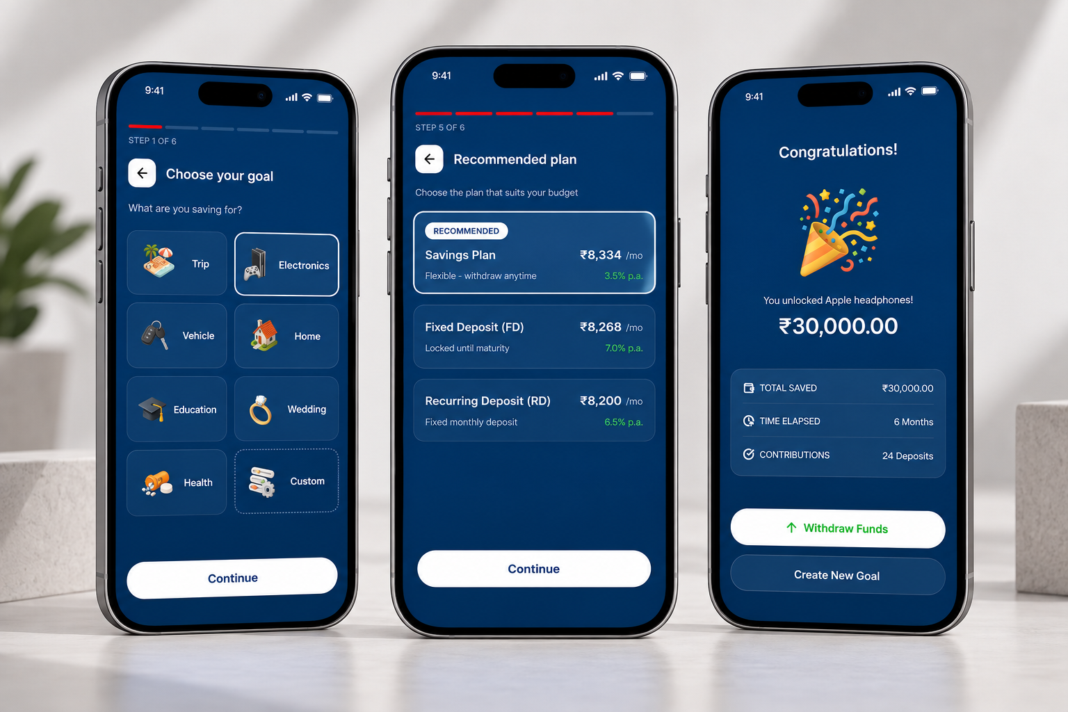
Creating a goal is six questions, never bundled: what, name, amount, date, plan, payment method. A step counter keeps the end always in view.
Rule 02
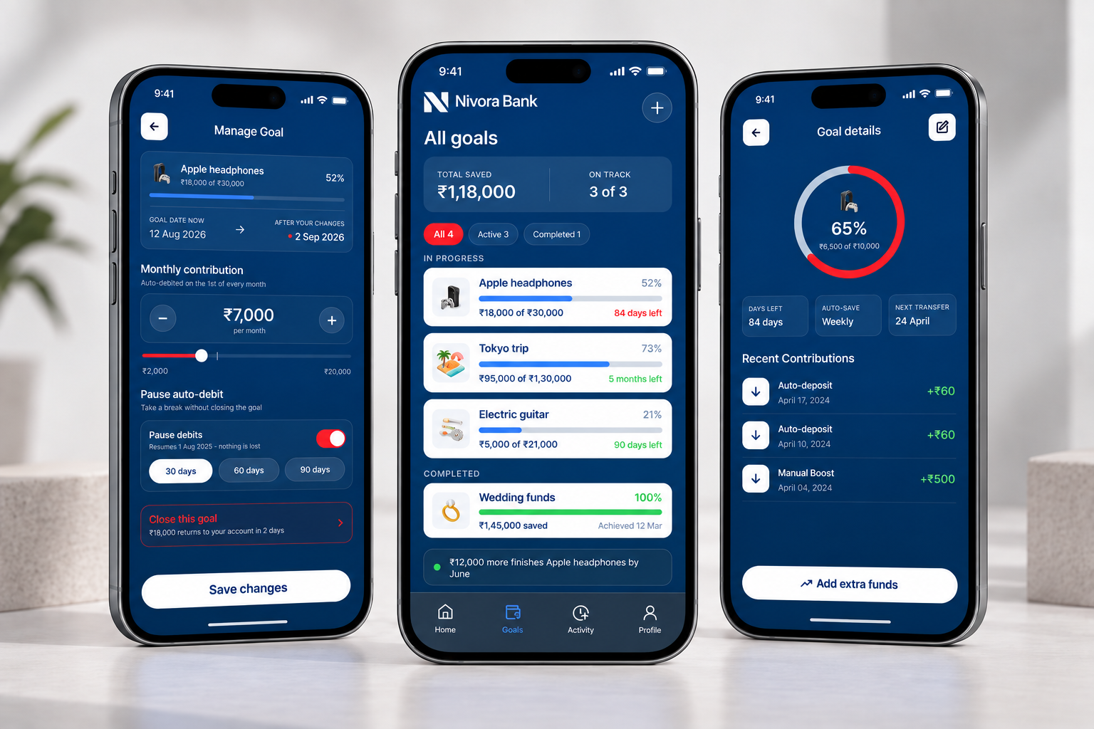
Progress is the product.
Every screen repeats the same three numbers: percentage, amount saved, days left. You never have to re-learn where to look.
Rule 03
Products, not jargon.
Savings, FD, and RD are shown as monthly amounts first, rate second. You compare ₹8,334 against ₹8,268, not 3.5% p.a. against 7% p.a.
The System
Two grounds, one meaning each: the six-step creation flow runs on navy, a one-time, focused setup. The daily shell (home, goals, activity, profile) runs on white, the place you keep coming back.
Color follows the same rule: red is progress-fill and destructive actions only. It never fights against the thing it represents.
What I'd test next
Whether the six-step flow survives contact with real users, or needs to collapse to three. Whether the red progress arc reads as on track or as an error state.
Neither was user-tested, designed on informed assumption, not research. That's the gap I'd close first if this became real.
drawn by hand · built with react · Tanvi, 2026